“When it comes to creating online graphic design portfolios, there are many factors you should consider. Costly mistakes can lose you the client before you even know it. So what is it that builds that necessary appeal?
I think that when creating an online portfolio it is vital to look at your competitors and try to analysis any mistakes that they have made, this could really help me when looking at things to avoid in my own project.
Kyle Meyer of Astheria dedicated a blog entirely to this; in his post he looked at 200 online portfolios and identified 7 common mistakes:
1) Bad navigation
2) Zoomed and cropped thumbnails
3) Mystery meat squares
4) No phone number
5) No email
6) No contact info of any kind
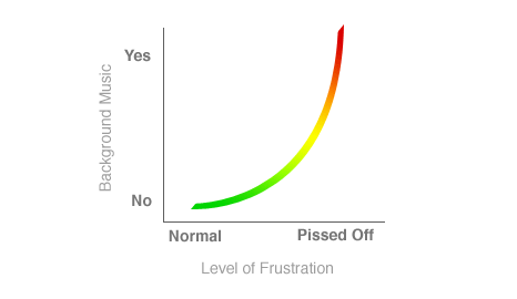
7) Background music
See below for actual post
Please Enjoy
My Last Portfolio Sucked, Yours Might Too
Last evening I was browsing a few portfolios after having a discussion with a friend who was redoing his own. I have to say it was a frustrating experience just looking through a few. In fact it was so frustrating, this post came as a result: after browsing 200 portfolios and keeping track of certain criteria I know I never want a job in human resources.
I hope this will be useful to those of you looking to create or reevaluate your portfolio. Yes I’m an opinionated bloke, but I think you’ll see my reasoning as relatively common sense items that people just overlook.
As a forward, I’d like to reinforce that this is hardly a scientific research project, but at 200 portfolios I’d say that things are fairly indicative of a more thorough census. As always, I’m not one to link specifically to the sites that I’m giving a negative opinion on, but there are screenshots to illustrate. The goals which each portfolio should strive for are relatively simple:
- Impress the viewer within the first 10 seconds visually
- Allow the viewer to succeed in their goals: viewing your work or contacting you
At any rate, let’s begin with the most grievous of errors:
32% had navigation problems
Quite a few people decided that their portfolio was a great place to try out the newest navigation trick they could come up with, even though it impedes the whole reason a user would visit the site: to see the work quickly, note down some contact information, and move on. The less thinking I have to do to accomplish my goal is a good thing. Unless you’re an experimental navigation designer, I wouldn’t advise it. Some of the weirdest ones I’ve seen have been a play on a rubix cube and 3D movement.
Some of the other ideas were pretty neat to play with, but they still hindered me from actually evaluating any portfolio pieces.
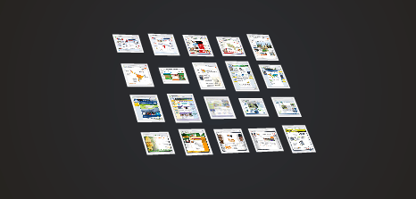
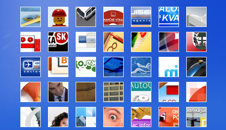
72% used thumbnails that forced me to view a larger image
This is probably the most often overlooked problem with portfolios, and the research agrees. The criteria is relatively simple: if a user can not interpret what the design is by the thumbnail it fails. The problem with thumbnails is that it forces your portfolio’s design and initial impact to make me feel compelled to wade through clicking individual pieces of your work. Often I didn’t even have a clue what the thumbnail was of.
Zoomed in and cropped thumbnails seemed to be a rather large trend, and they’re a nasty bunch. Right up there with the 40 pixel square thumbnails that are more of spots of color on the page than previews of the piece of work. Put simply, if you show your work up front and don’t require action and effort on the part of the viewer, they’re more likely to look at more of your work and look a bit more in-depth on pieces that catch their interest. I can’t decide if something piques my interest from a thumbnail.
11% decided to make their portfolio a game of peek-a-boo surprises
Even worse than thumbnails are the dreaded mystery meat squares. A surprising number of sites took this approach or used plain text links. Neither of which lets me scan any amount of work at a reasonable rate, or review pieces that I found interesting at a glance.
32% did not include a phone number
23% did not include a physical email
1% had no discernible contact information
Make it easy to get in touch, that is your goal and purpose for the portfolio. Phone numbers are very handy—not that I see them as a complete necessity—but having an email address to copy into an address book or note down is far more useful than a contact form. Many people are simply evaluating you, and won’t be making contact with you immediately. Not having any contact information they can take down and have available in their notes doesn’t make things any easier for them.
4% had music that automatically began playing when I viewed the site
For your own sake, don’t have music set to begin playing when a visitor arrives at your site. While browsing I currently had 28 or so portfolios open in tabs at once—something I’d expect from someone in HR. Suddenly, I had some odd atmospheric music clashing with my own.
Rather than reviewing portfolios the first thing I did was begin closing tabs until the music stopped. Your chance of getting a job in this situation? Zilch.
Conclusion
Chanpory Rith, of Life Clever suggests three other portfolio mistakes:
· Flash Animation
· No project labels
· No CV
He argues the most notable of these is the third mistake and points to the article written by Seth Godin - why bother having a resume?
“Great people should not have a CV, here’s why – A resume is an excuse to reject you. Once you send me a resume, I can say, Oh they are missing this or that, and boom you’re out”